
We believe in positive security that helps to protect current and future business value. Clear communication is essential for making that happen - but communication is hard, especially when you have to provide clarity about complicated things.
Communicating cyber risk using measured, quantified methods allows you to explicitly convey uncertainty and a range of outcomes more clearly than ambiguous, qualitative methods that tend to implicitly hide these factors.
To put it another way: the red, amber, green classifications or 1-5 ordinal scales you see in most risk assessments aren’t helping you. In fact, they’re probably making things worse.
The 5x5 matrix just gets in the way
In lots of cyber assessment documents, you’ll often see a ‘five by five’ risk matrix (or ‘PIG’ - probability impact graph) that plots impact on one axis, against likelihood on the other. Whether a security practitioner likes it or not, they are making a series of assumptions and assigning subjective values every time they fill one of these things in.
Even if lots of effort is put into understanding and measuring meaningful things, putting those judgments into the matrix is like viewing the information on a low-resolution monitor: everything gets pixelated. There’s less clarity about the risk.
Worse still, matrices like these can also be confusing and contradictory.
Take this example, inspired by some real-world examples we’ve seen:
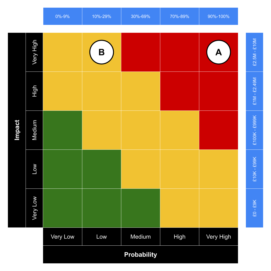 An example risk matrix where the priority of risks may be confused.
In cases like this, organisations use qualitative labels (like “low”, “high”) and a red-amber-green (RAG) colour coding system to communicate and prioritise risk. These are shows in the black bars alongside the 5x5 grid. But the qualitative ranges of these labels, added by us in the blue bars to the top and right, show the potential for undesirable results:
- Risk A is £2.5 million impact and 90% likelihood, representing a £2.25 million risk to the organisation, is coded as a ‘red’ risk
- Risk B has a £10 million impact and 29% likelihood, and represents a £2.9 million risk, while seemingly being of the lower ‘amber’ priority
So it looks like Risk A is the more pressing issue. But Risk B is statistically worse, to the tune of £650,000.
This legacy approach to conducting risk assessments also over-indexes on high impact, low probability (or ‘black swan’) risk events. The worst case scenario is always adopted. This masks the opportunity to demonstrate the value gained from controls that prevent or contain day-to-day events.
This ambiguity makes it difficult for organisations to successfully prioritise and optimise security to address the risks they face.
There’s a better way.
Quantitative methods embrace uncertainty
We believe in a more demonstrable and provable method of assessing and communicating risk.
We use the best available information as inputs to our risk assessments. We apply expert judgement to historical and current information, and future expectations. Where possible, previous incident data helps to calibrate our work. We also draw on open source intelligence to refine estimates and assumptions.
Where you don’t have exact figures it is simple to make calibrated estimations or assumptions to support analysis or the valuation of assets. If more subjective estimations or assumptions are used our repeatable method allows us to refine the model over time to converge on results.
Our focus is on accuracy over precision: selecting values that capture the range of consequences most likely to occur rather than a specific decimal value. We can communicate these ranges to stakeholders so they understand the confidence in the analysis. Improving and measuring the increase in confidence also helps demonstrate progress in your security programme over time.
Then we run thousands of simulations for each risk scenario to experiment and establish the range of potential outcomes for each given scenario.
The result is a loss exceedance curve – shown here from our own risk app – that shows the spectrum of possible outcomes: generally from more frequent, lower consequence to the long tail of black swan events:
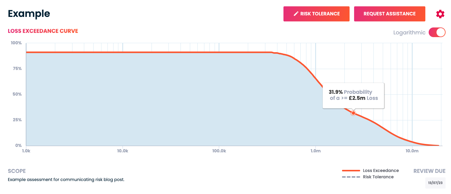 An example loss exceedance curve from Cydea’s risk app.
That brings with it a range of benefits to our clients:
- The results can be expressed financially; a common and pre-existing language across the business
- It becomes a quick and easy way to make business cases and security investment decisions
- You gain the ability to measure the effectiveness of security measures
And, of course, because our analysis is statistical, we can also add it up to give an overall risk position. This is helpful when answering the “What is our risk?” question favoured by boards. No more worrying about how to add up 10 greens, 7 ambers, and 3 reds - you can give answers like “There’s a 75% chance that an incident will cost us £50,000”; or answer relative to your insurance, like “There is a 5% chance an incident would exceed our cyber insurance cover.”
Communicate by breaking things down
Communicating complicated information usually means simplifying it first, making it easy for others to grasp the basics before diving into the detail. Although risk matrices try to do that, they usually fail because they’re misleading and sometimes contradictory, or over-index on black swan events.
Using a quantitative approach doesn’t just give you a clearer picture, it also helps you communicate that picture to the people who need to see, and do so in higher fidelity.
The Cydea Risk Platform is a great way to collaborate on and communicate an accurate view of your cyber risk.
Photo by Firmbee.com on Unsplash