
In What do you do when there’s more than one risk? I talked about why, when you want to consider multiple risks together, you can’t just add them together. In this post we will look more into the maths behind dealing with compound probabilities and, with that, the calculation of compound risks.
In the first post in this series (Quantitative Risk Analysis), we looked at a methodology for calculating the risk profile of a single risk, plotting the likelihood of a given risk event exceeding a range of loss values.
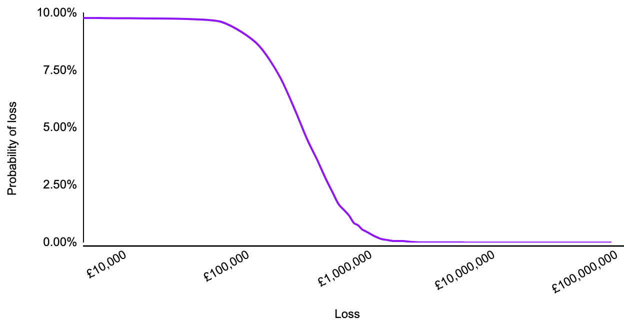
And in Qualitative and quantitative risk analysis I discussed how this method could be repeated to compare inherent and residual risk against risk tolerance.
Risks rarely sit in isolation
Individual risks rarely sit in isolation, and the controls implemented to remediate one risk will likely have an impact on multiple risks.
As we did for a single risk, we’re going to use a simplified model, with the aim to provide an accurate, useful view of an organisation’s risk profile. We apply the following assumptions:
All risks are independent of each other
The probability of one risk isn’t impacted by the probability of another, nor are their impacts influenced by each other
No risks are mutually exclusive
The occurrence of one risk doesn’t preclude the realisation of another.
Calculating the compound risk
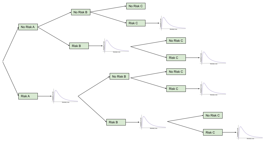
So how do we calculate the compound risk? Just as with the comparison between inherent and residual risk, we need to repeat the method learnt earlier. This time though we need to do it sequentially.
The diagram below shows the four different possible outcomes if there are 2 risks:
A and B don’t happen
A doesn’t happen, B does.
A happens, B doesn’t.
A and B both happen
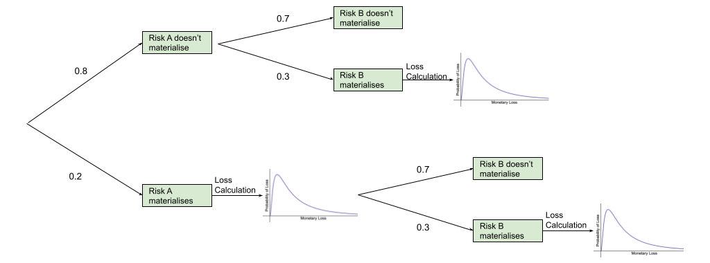
That means we run the simulation for the first risk and then, if the risk materialises, we calculate the impact using the probability distribution, otherwise the impact is 0. Then, regardless of the results of the first risk’s simulation result, we run the simulation for the second risk. The impacts are then summed together.
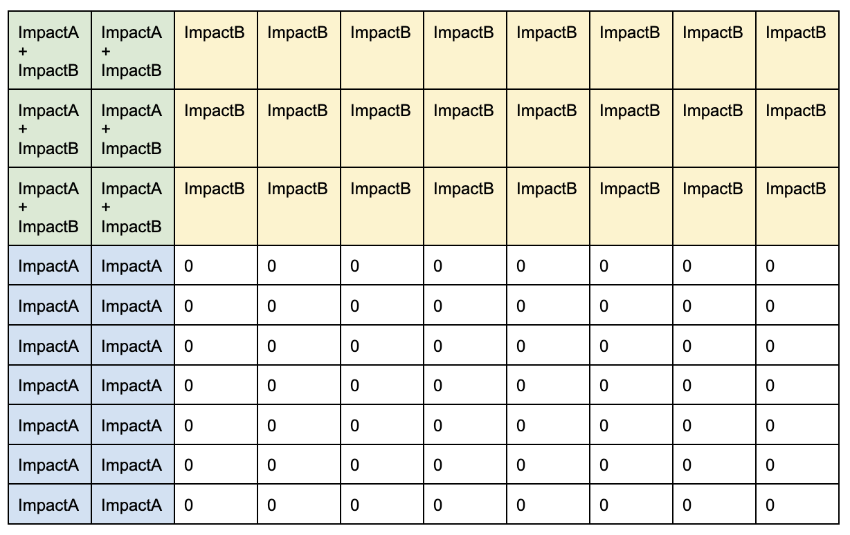
So if we run the combined simulation 100 times, we would expect the results to approximate the table below. The more times we run a simulation, the closer the results would be to the proportions in this model. It is the randomness in the Monte Carlo simulation that allows it to approximate the real life results.
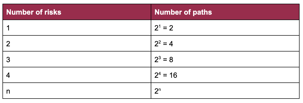
Is there a limit to the number of risks that can be grouped?
The biggest thing to consider when deciding how many individual risks to include in a compound risk calculation is the amount of computing power required for the calculation. This is especially important to think about if you are using a spreadsheet to calculate the risks - it is super frustrating to spend what feels like an eternity (but is usually several minutes!) waiting for the spreadsheet to complete the calculations, only for it to give up part way through.
So keep in mind that each risk added doubles the number of possible paths:
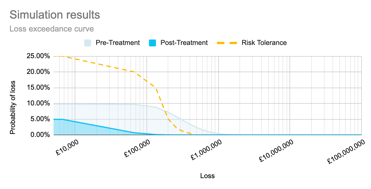
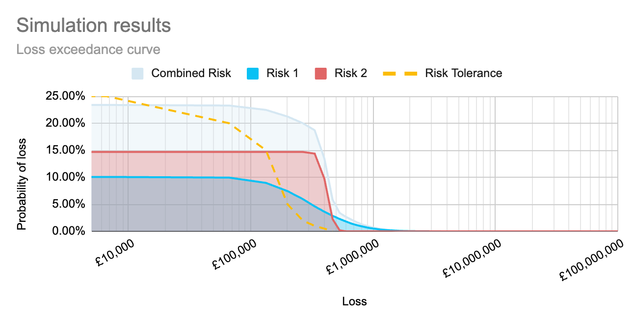
By running simulations to calculate each risk separately, as well as to calculate the compound risk, we can create the graph below to show how each risk sits within the organisation’s risk tolerance, as well as how those risks together sit within the organisation’s tolerance. This allows an organisation to view the full impact of the implementation of a proposed control, both on individual risk scenarios, and as an aggregate across multiple impacted risk scenarios.
This post looked at combining independent events. In an upcoming post, we will discuss how we can change the simulations to account for risks that impact other risks.
Headline photo by John Schnobrich on Unsplash